
Regularly I stumble upon forms in the web that could be done better ... actually they have to be done! "Stumbling" is still friendly to say the least: Some forms drive me into despair. Only yesterday I wanted to set up a business customer account with PayPal. Absolute madness. I aborted, despite several attempts. First my mail address was not accepted because I already use it for a private account, then the credit card and so it went on until I lost the desire.
Now you could say "the problem is always in front of the computer! Sure, but since I don't consider myself to be particularly under-average intelligent, but I do have a strong affinity for the online world, I think it's not only me. Only contradict me if you see it differently.
But what makes good forms? "What do I want to achieve as the provider of the form," is a good question after all, but the better one is: "What should the user be able to achieve with it?
The challenge with a form is to help the user to enter his data easily, fearlessly and joyfully. This may sound a bit pompous, but remember that some forms are aggressive.
So what makes good forms, how can they be better designed?
15 tips for better forms
Welcome the user.
No matter whether the user would like to register for a newsletter, a store or a service using the form: He would like to feel wanted. Give him this feeling! Tell them something about what to expect after registration and welcome them in this way!
Remember the context.
Ask in which context the user is located. Is he using a computer with a web browser? A browser on a mobile device? An app or a smart TV application? Because this has an impact on the form. Rigid layouts are so small on the mobile device that it is almost impossible to switch fields. On apps and smart TVs, you can offer customized virtual keyboards that match the field content. When entering an e-mail address, for example, nobody needs capital letters, but "@" and typical domain endings do.
Take away the fear of the form.
The user finds forms stressful because they are usually about something serious. As with official documents, it seems extremely important that the form is filled out correctly. Otherwise, a nebulous sanction of some kind "threatens" to be imposed.
Do it differently and reassure the user that there is nothing to be afraid of. Give him the opportunity to check everything again at the end - and also tell him that he will have this opportunity.
Talk to the user through the form.
From the user's perspective, all questions are annoying. "Why do they want to know this?" He doesn't know. And it doesn't cost much to let him know: "We want your name so that we know who to send an e-mail to if you forget your access data"; "We want your date of birth because the law obliges us to do so - nobody sees it but us". And so on.
For more complex fields, it is advisable to provide a minimum of advice appropriate to the current field, which can vary depending on the context. On the web, where there is no shortage of space, you can draw on the full potential.

This gives the user the feeling that he is not being squeezed out here with the garish interrogation lamp. But that all information has its purpose. Take this opportunity to consider whether this is really the case: if the desired information does not serve a well-founded purpose: then what is the point of collecting them at all?
Fulfill the wish of the user.
The wish from a business point of view is of course that the user fills in the form as completely as possible. On the other hand, the user wants to complete the form as quickly as possible, or at least without a fit of anger, in order to achieve the purpose of the form. So if, when placing an order, the user asks for more than the goods to be ordered and the absolutely necessary customer data, he will inevitably get in the way of the customer's wish.
If you pay attention to this you fulfill the usability dialog design principle of "task adequacy" according to ISO 9241-110.
Be modest ...
Especially with registration forms, one can still encounter many services that want to know as much as possible about the user. It goes also completely differently:
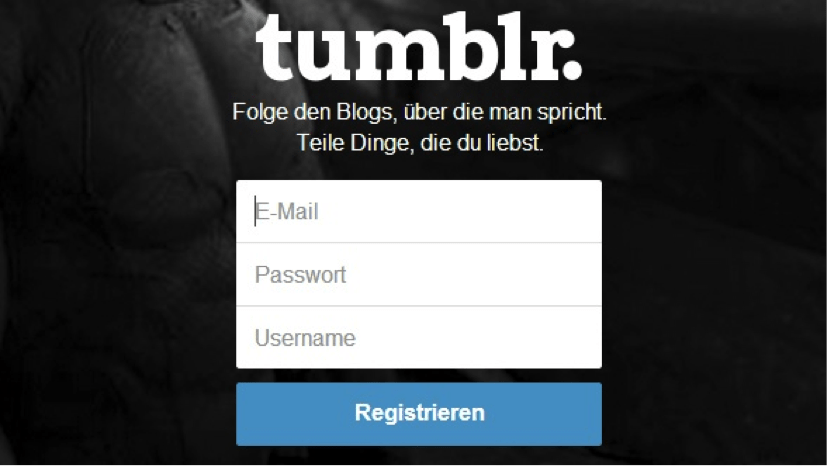
Less is more: Tumblr naturally wants to know more from the user later, but at first the service is invitingly modest. Email address, password, username - only the most necessary information is inviting.
Extensive forms with many input fields have a deterrent effect. But if you can log in with only two or three fields, you will find this great. So be modest and only ask for the information that is really necessary.
... but be persistent.
Please feel free to postpone further questions to a later date, if possible. In the store or commercial services, for example, you need payment data. But why do you have to ask for them in detail when you register?
You just do not have to. You can wait until the customer has looked around and wants something. Every user will realize that address and payment data are necessary for the purchase.
Split up large forms.
If really many inputs are necessary: Consider whether these forms could also be processed in several steps, with each step possibly requesting useful partial information. After all, long input field deserts say one thing above all: "This is where work comes to you!
With several form pages, however, the user has the feeling of groping through the dark. It is then important to give a percentage to show how much you have already done. This gives the user the feeling of having a manageable form territory in front of him.

Clarify the meaning.
Five fields of the same size that query name, address, postal code and street are naturally prone to errors, because all fields look the same. Give the fields meaning, for example by making the postal code really a short field just for numbers or by using a fill-in function to help the city field.
By the way, this also fulfills the usability dialog design principle of "self-descriptiveness" of ISO 9241-110.
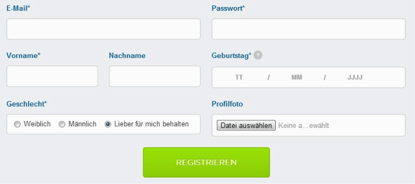
Icons and other visual elements can also help to give the user certainty at all times about what data is being requested. It also makes sense to present data that belongs together in small groups ("law of proximity", design psychology).
It is also very helpful to fill fields with sample data so that the user can recognize the given format, for example when entering the date. But make sure that the sample texts are in the input field as background information.
Avoid forgetful and hectic forms.
Something that is guaranteed to make the other side of the screen scream with rage is forgetful forms. One click on "Back" in the browser - and the data is gone. A classic also: The form reports an error and forgets all contents when reloading.
This also includes forms that are literally standing next to one with a stopwatch. If you already do, you should see this stopwatch.
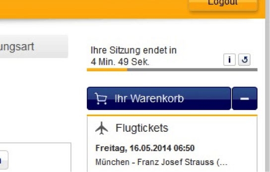
Consider the context: users are sitting in the office, perhaps filling out the form in between. Or they are parents who have to look after their child in between. If after 15 minutes a session (not visible to users) expires, it doesn't put them in a good mood.
The fact that there is both again and again is a real mystery to me. By the way, the forgetful form contradicts the usability dialog design principle of "fault tolerance" and the hectic one that of "controllability".
Visualize the filling out.
Ten unchangeable input fields do not give the user any feedback. If, however, each completed field shows a check mark, the user can really feel how he is progressing.
For example, you could mark all fields with a color like yellow to indicate that they should be filled in - and green if you are (correctly) filled in.
Always make it clear where the fields are really mandatory - and where the user can also leave out voluntary information, for example, because he is in a hurry. Such data can still be obtained later.
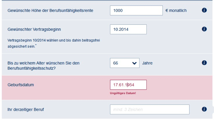
Mark missing or incorrectly filled out fields.
Some forms eject an unspecific error message after error input and expect the user to find the error himself. But if the user has to work, the form designer has not worked hard enough.
It is better to use the fact that the form knows where the error lies - and can make the field in question visible with a note.

If several errors occur, several fields should of course be marked - and not only the first or last erroneous field, which is why the user has to struggle through individual error messages from reload to reload.
Use inline validation.
It is common practice for password fields to give feedback on the strength of the chosen password. This is of course more complex, but any field can use this kind of intelligence. For example, you can then determine whether the entered data is really an e-mail address or a postal code - so you don't have to wait until the form is sent.
Therefore, if possible, build plausibility checks into the field, not into the form. Advantage: This way, the form ensures that it is filled out correctly by itself. This reduces the probability of having to show the user an "error message", which is never good in the end.
Do not call it "error".
If something goes wrong: Beeeeeep: Error! This clearly signals: The user is to blame! Can this contribute to a positive user experience? Certainly not.
And most of them are misunderstandings anyway. "Oops - is this zip code really correct?", "Thank you for filling it out, but we need the following information ...", "Please tell us that, we need it because ...". - there are better ways than simply displaying an "error" and putting red threatening colors including exclamation mark in front of the user.
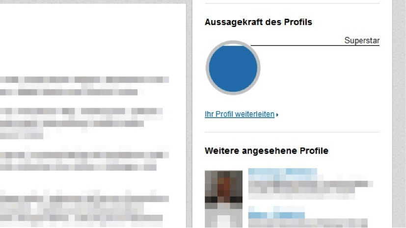
Arouse the desire to complete something.
Facebook can be imagined as an infinitely large query form that is never satisfied. It constantly asks for more data - but you can ignore that. It's annoying, but the idea is not bad: If you want to know more about your customers, you can always ask for it - but with restraint.
Give the user the prospect of the satisfying feeling that he can reach the point where all questions are answered. This can be achieved, for example, by indicating a percentage: "Profile 70 percent complete" indicates that the 30 percent could be completed quickly - but without forcing the user to do so. It is also possible to "gamify" this a little and thus - like LinkedIn - create a playful attraction to answer as many data questions as possible.
Conclusion
To "hate" a web form is probably the most obvious manifestation of a negative user experience. And because every provider of a form (actually) wants it to be filled out and sent, it is worth thinking about it.


.jpeg)


