We write texts every day: e-mails, messages, texts for presentations, websites and user interfaces, marketing texts and perhaps, as in my case, for a blog article. But we rarely think about the usability of text. But texts also have a usability and this is often expandable.
The user's problem: information overload
We receive an average of 18 professional e-mails per day. In addition, we receive 37 WhatsApp messages that take us 29 minutes to read, 149 minutes to surf the web and 221 minutes to watch TV. On the way, we pass posters and information terminals and letters and flyers are waiting in our mailbox.
Through all these and other media we receive one thing: information. Whether relevant or not, there is one thing above all: too much.
No miracle that the Institut for consumption and behavior research already calculated 2004 for Germany an information overload of 98%. This means that 98% of all information that we encounter in this way is no longer perceived. They have missed their purpose. So what do we do when we actually have something important to tell our readers?
Motives for reading a text
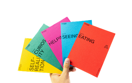
We have to give the user a reason to take a closer look at our scribbling. We achieve this by using one of the following five motifs in the headline:

Especially motivating are advantages or things that make us curious. Even when it is about something familiar to us, e.g. our own city, we listen up. In the ideal case we now have the attention of the user. But now comes the actually difficult part. The user has to understand the information, process it as quickly as possible and must not get bored. Otherwise we will lose them again immediately. After all, there are countless other things he can do.
Writing relevant, understandable and clear texts
This is actually not that difficult. Of course, the text must first fit in terms of content. The rule of thumb is: as short as possible, but as long as necessary. Our text should therefore contain all the information relevant to the user. You are welcome to use examples, as long as they provide a clear benefit. This is the case, for example, if they illustrate what is written or arouse feelings in the reader. But check critically if you can leave out something that is not important for your actual statement.
But not only the length and content are relevant for the good usability of a text. There are also formal criteria that make a text easier to read and more attractive. To optimize our texts in this respect, the editing system can help with the following 10 points.
The editing system
- Limit sentence lengths, maximum 14 words per sentence.
- Control word lengths, maximum 5 syllables per word. Often you can reduce the size of "Word monster". An example: "automotive supplier conference" vs. "conference of automotive suppliers".
- Avoid pictureless nouns, as they do not appeal to the reader's senses or feelings. You can recognize them by the following endings: -ung, -keit, -heit, -ät, -ion, -ive, -ismus
- Check foreign and fashion words and replace them if necessary.
- Strike auxiliary verbs like can, must, want, may, want, should. These make texts vague. The classic example: "I would like to apply for a job..." Yeah, go ahead.
-
- Check if you really need passive constructions, because they make texts more complicated.
- Do not use sentences in the subjunctive. Not "This could be your new bicycle", but "This is your new bicycle". This turns on the reader's head cinema.
- Control pronouns. Where can I / we / ourselves be replaced by you / yours? This makes the text more personal.
- Abstain from negative terms and words like none and not, because they can trigger negative associations. Replace "no problem" for example by "very simple".
- Strike repetitions.
But before you get started, one important limitation: These points help uncover potential for improvement. But they are not a must. In other words, you check in detail whether a change really does make the text better.
In any case it is worthwhile to critically revise a written text once again. On the one hand for the user, who will find reading more pleasant and receive all the information that is important for him. On the other hand for us, the authors. After all, we have something to say. And it would be a pity if, in the flood of information, it did not reach our readers, or only partially reached them.


.jpeg)


